
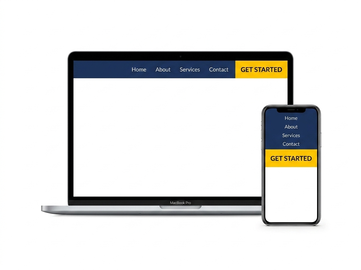
If visitors land on your website and leave within seconds, your website navigation design might be the problem. Navigation is the roadmap of your site — and when it’s confusing, cluttered, or hard to use on mobile, people bounce. The good news? A few smart changes can make a massive difference in how long visitors stay and how many of them actually convert into customers.
In this post, we’re breaking down the most effective website navigation best practices that reduce bounce rate, improve user experience, and help your business grow online.
Why Website Navigation Design Directly Impacts Bounce Rate
Your bounce rate measures how many visitors leave your site after viewing only one page. A high bounce rate often signals that users couldn’t find what they were looking for — and that’s almost always a navigation problem. When people feel lost or frustrated, they don’t stick around to figure it out. They just leave.
Good navigation does more than look pretty. It guides your visitors toward the information or action they came for — whether that’s booking a service, reading a blog post, or making a purchase. Think of it as the difference between a well-organized store and one where nothing has labels. One keeps you browsing; the other sends you straight to the exit.
The Connection Between UX and SEO
Search engines like Google pay attention to user behavior signals. When visitors bounce quickly, it tells Google your page may not be delivering value — which can hurt your rankings over time. Strong website navigation design improves dwell time, encourages deeper browsing, and sends positive signals to search engines. It’s a win for both your users and your SEO. If you want to learn more about how design affects your rankings, check out our guide on SEO-friendly website design tips.
Core Website Navigation Best Practices You Should Follow
Let’s get into the practical stuff. These are the navigation strategies that consistently work for small business websites and e-commerce stores alike.
1. Keep Your Menu Simple and Focused
One of the biggest mistakes business owners make is cramming too many options into their main navigation menu. More choices don’t mean more engagement — they mean more confusion. Aim for five to seven top-level menu items at most. Each item should represent a clear, distinct section of your site.
- Use short, descriptive labels like “Services,” “About,” “Blog,” and “Contact”
- Avoid vague labels like “Solutions” or “Resources” that don’t tell users what to expect
- Group related pages under dropdown menus to keep the top bar clean
- Make sure your most important pages — like your contact page or main service page — are always one click away
2. Make Navigation Mobile-Friendly
More than half of all web traffic comes from mobile devices. If your navigation doesn’t work well on a phone or tablet, you’re losing a huge chunk of potential customers. A mobile-friendly navigation design typically uses a hamburger menu (the three-line icon) that expands when tapped, with large, easy-to-tap links.
- Test your menu on multiple screen sizes before publishing
- Ensure tap targets are at least 44×44 pixels for easy use on touchscreens
- Avoid hover-only dropdowns — they don’t work on mobile
- Keep mobile menus short and prioritize your most important pages
3. Use a Sticky or Fixed Navigation Bar
A sticky navigation bar stays visible as users scroll down the page. This is especially useful on longer pages where visitors might otherwise have to scroll all the way back to the top to find the menu. Sticky navigation keeps your key links accessible at all times, reducing friction and encouraging users to explore more of your site.
This small design choice can have a noticeable impact on how long visitors stay on your site — and how many pages they visit before leaving.
4. Add a Search Bar for Larger Sites
If your website has a blog, a product catalog, or a large resource library, a search bar is a must. It gives users a direct path to exactly what they’re looking for without having to click through multiple menus. Place it prominently — either in the header or within the navigation bar itself — so it’s easy to find.
Visual Design Tips That Support Better Navigation
Navigation isn’t just about structure — it’s also about how things look. Visual cues help users understand where they are on your site and what they should do next.
Highlight the Active Page
Use a visual indicator — like a different color, underline, or bold text — to show users which page they’re currently on. This simple touch helps people orient themselves within your site and reduces the feeling of being lost. It’s a small detail that makes a big difference in overall user experience.
Use Contrasting Colors for Clarity
Your navigation menu should stand out from the rest of your page content. Use high-contrast colors so links are easy to read and clearly distinguishable from body text. Avoid using the same color for your navigation links as your background — this makes them nearly invisible and frustrates users.
Include a Clear Call-to-Action in the Header
Your navigation bar is prime real estate. Don’t waste it. Include a call-to-action button — like “Get a Free Quote,” “Book a Call,” or “Shop Now” — directly in your header. This gives visitors a clear next step the moment they land on your site, which can significantly improve your conversion rate. For more tips on turning visitors into leads, read our post on website conversion optimization strategies.
Common Navigation Mistakes to Avoid
Even well-intentioned designs can go wrong. Here are a few navigation pitfalls that commonly hurt small business websites:
- Too many menu items: Overwhelms users and dilutes the importance of each page
- Inconsistent navigation across pages: Confuses visitors and breaks trust
- No breadcrumbs on deep pages: Makes it hard for users to backtrack without hitting the browser’s back button
- Broken links in the menu: Instantly damages credibility and frustrates users
- Hiding the navigation on mobile: If users can’t find the menu, they’ll leave
- Simple, focused menus with five to seven items reduce decision fatigue and keep users engaged
- Mobile-friendly website navigation design is non-negotiable — over half your traffic is on mobile
- Sticky navigation bars improve page exploration and reduce bounce rate
- Visual cues like active page highlights and high-contrast colors improve usability
- A clear call-to-action button in your header can dramatically boost conversions
Great website navigation design isn’t about being flashy — it’s about being clear, intuitive, and helpful. When visitors can easily find what they need, they stay longer, explore more, and are far more likely to take action. And that’s exactly what your business needs to grow online.
If you’re not sure whether your current navigation is helping or hurting your business, we’d love to take a look. Our team at LetsGetSocialOnline.com specializes in website design and digital strategy for small businesses and entrepreneurs. Contact us today for a free website review and let’s build a site that actually works for you.