
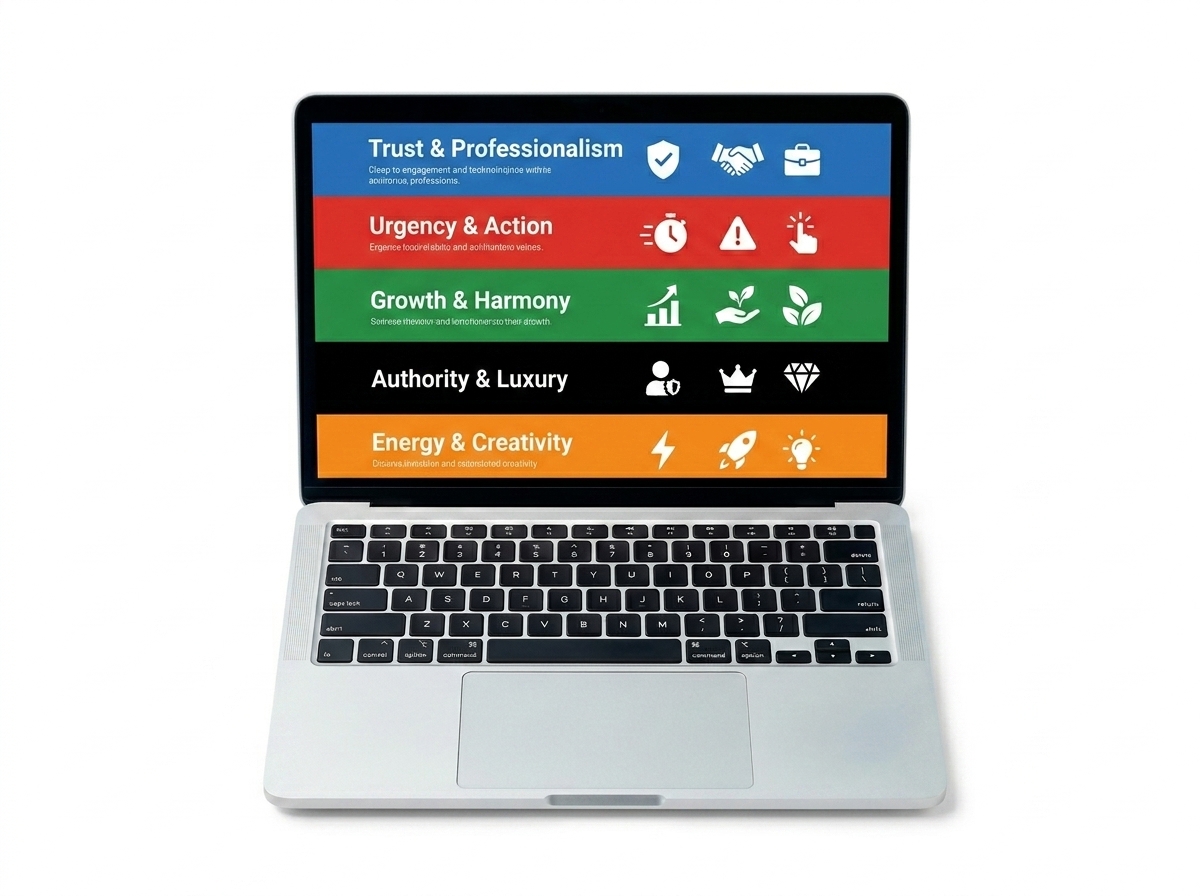
When someone lands on your website, they form an opinion in less than a second — and a huge part of that snap judgment comes down to color. Color psychology in web design is one of the most powerful (and most overlooked) tools you have for turning casual visitors into loyal customers. The colors you choose don’t just make your site look pretty — they trigger emotions, build trust, and guide people toward taking action.
If you’ve ever wondered why big brands are so protective of their signature colors, this is exactly why. Color is a silent salesperson working around the clock on your website. Let’s break down how it works and what you can do to use it strategically for your business.
Why Color Psychology Matters More Than You Think
Studies show that color increases brand recognition by up to 80% and influences up to 85% of purchasing decisions. That’s not a small detail — that’s a major driver of revenue. When you apply color psychology in web design intentionally, you’re essentially speaking to your visitors’ subconscious before they’ve read a single word on your page.
Think about it this way: if you walked into a store and everything was painted in harsh, clashing colors, you’d probably feel uneasy and leave quickly. Your website works the same way. The right color palette creates an environment where visitors feel comfortable, confident, and ready to buy.
The Emotional Language of Color
Every color carries emotional associations that are deeply ingrained in human psychology. Here’s a quick breakdown of what the most common colors communicate:
- Blue: Trust, reliability, and calm — popular with banks, tech companies, and healthcare brands.
- Red: Urgency, excitement, and passion — great for sales, food brands, and call-to-action buttons.
- Green: Growth, health, and prosperity — ideal for eco-friendly brands, wellness, and finance.
- Yellow: Optimism, energy, and warmth — works well for creative brands and attention-grabbing accents.
- Orange: Enthusiasm and affordability — often used for CTAs and budget-friendly brands.
- Black: Luxury, sophistication, and authority — a go-to for premium and high-end brands.
- White: Cleanliness, simplicity, and space — essential for minimalist designs and healthcare.
Choosing colors that align with your brand personality and your audience’s expectations is the foundation of effective color psychology in web design. If your colors send the wrong emotional signal, visitors may leave without even knowing why.
How Color Directly Impacts Your Conversion Rates
Conversions happen when visitors take a desired action — clicking a button, filling out a form, or making a purchase. Color plays a direct role in whether or not that action happens. The wrong color on a call-to-action button can make it invisible. The right color can make it impossible to ignore.
One of the most well-known examples in digital marketing is the button color test. In multiple A/B tests, simply changing a button from green to red (or vice versa) has resulted in conversion increases of 20–30%. That’s significant growth from one small design change. This is why smart web design decisions go far beyond aesthetics.
Strategic Color Placement for Higher Conversions
It’s not just about which colors you use — it’s about where and how you use them. Here are some practical strategies to apply right now:
- Use contrast for CTAs: Your call-to-action buttons should stand out from the rest of your page. If your site is mostly blue, try an orange or yellow button to draw the eye.
- Limit your palette: Stick to 2–3 primary colors to avoid visual overwhelm. Too many colors make your site look unprofessional and confusing.
- Use white space strategically: White (or negative space) isn’t boring — it gives your content room to breathe and directs attention to what matters most.
- Match colors to your audience: Research shows men and women often respond differently to colors. Younger audiences tend to prefer bold, vibrant palettes, while older audiences may respond better to muted, classic tones.
- Be consistent across pages: Color consistency builds brand recognition and trust. Every page of your site should feel like it belongs to the same family.
Choosing the Right Color Palette for Your Brand
Before you start picking colors, get clear on your brand identity. Ask yourself: What emotions do I want my customers to feel when they visit my site? What does my brand stand for? Who is my ideal customer? Your answers will guide your color choices far more effectively than just picking what looks nice to you personally.
If you’re a health and wellness brand, greens and soft blues communicate calm and trust. If you’re an e-commerce store running frequent promotions, reds and oranges create urgency and excitement. If you’re a luxury service provider, deep blacks, golds, and whites signal premium quality. Understanding your positioning is the first step — and if you need help defining that, our brand strategy services can get you there faster.
Tools to Help You Build a Color Palette
You don’t need to be a designer to build a great color palette. These free tools make it easy:
- Coolors.co — Generate beautiful, harmonious color palettes in seconds.
- Adobe Color — Explore color theory and create palettes based on rules like complementary or analogous colors.
- Canva Color Palette Generator — Upload an image and extract a palette from it.
- Contrast Checker (WebAIM) — Make sure your text and background colors meet accessibility standards.
Accessibility matters too. Poor color contrast makes your site hard to read for people with visual impairments — and it can hurt your SEO rankings. Always check that your text is readable against its background. This is a core part of building an SEO-friendly website that works for everyone.
Common Color Mistakes That Kill Conversions
Even well-intentioned design choices can backfire if you’re not careful. Here are the most common color mistakes small business websites make:
- Using too many colors, making the site feel chaotic and untrustworthy.
- Choosing colors based on personal preference rather than audience psychology.
- Making CTA buttons blend into the background instead of standing out.
- Ignoring color accessibility and contrast ratios.
- Inconsistent color use across pages, weakening brand recognition.
The good news? These are all fixable. A strategic design audit can identify exactly where your color choices are costing you conversions — and what to do about it.
- Color psychology in web design directly influences how visitors feel, trust, and act on your website.
- Every color carries emotional associations — choose colors that align with your brand values and audience expectations.
- High-contrast, strategically placed CTA buttons can significantly increase your conversion rates.
- Limit your palette to 2–3 core colors for a professional, cohesive look that builds brand recognition.
- Always check color accessibility to ensure your site is readable for all users and optimized for SEO.
Color is one of the most powerful — and most underutilized — tools in your digital marketing toolkit. When you apply color psychology in web design with intention and strategy, you create a website that doesn’t just look good, but actually works hard to grow your business.
Ready to transform your website into a conversion machine? Contact our team at LetsGetSocialOnline.com today and let’s build a website that uses every design element — including color — to turn your visitors into customers.