
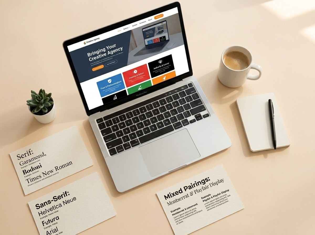
When most business owners think about what drives conversions on their website, they think about headlines, offers, or call-to-action buttons. But here’s something that often gets overlooked: website typography conversions are deeply connected. The fonts you choose — and how you use them — can either build trust and guide visitors toward action, or quietly push them away without them even knowing why.
Typography isn’t just about aesthetics. It’s about communication. The right font choices make your content easier to read, your brand more credible, and your visitors more likely to stick around long enough to become customers. Let’s break down exactly how to choose fonts that work for your business.
Why Typography Matters More Than You Think
Your website has about 3–5 seconds to make a first impression. In that window, visitors are absorbing your layout, colors, and yes — your fonts. Poor typography creates friction. It makes people work harder to read your content, and when reading feels like work, people leave.
On the flip side, clean, well-chosen typography creates a sense of professionalism and trust. It signals that you care about the details — and if you care about the details on your website, visitors assume you’ll care about the details in your products or services too.
The Psychology Behind Font Choices
Different font styles carry different emotional signals. Serif fonts (like Georgia or Times New Roman) feel traditional, authoritative, and trustworthy — great for law firms, financial services, or established brands. Sans-serif fonts (like Inter, Lato, or Open Sans) feel modern, clean, and approachable — a popular choice for tech companies, coaches, and service-based businesses.
Script and decorative fonts can add personality, but they should be used sparingly — think logo accents or short taglines, never body copy. The goal is always readability first, personality second.
How to Choose Fonts That Support Website Typography Conversions
Choosing fonts isn’t about picking what looks pretty to you. It’s about choosing what works for your audience and your goals. Here’s a practical framework to guide your decisions.
1. Prioritize Readability Above Everything
If your visitors can’t easily read your content, nothing else matters. Stick to fonts that are clean and legible at multiple sizes. For body text, aim for a font size of at least 16px and a line height of 1.5–1.7 to give your text room to breathe.
- Avoid overly decorative fonts for body copy
- Use high contrast between text and background (dark text on light backgrounds works best)
- Test your fonts on mobile — most of your traffic is probably coming from phones
- Limit your font palette to 2–3 fonts maximum
2. Create a Clear Visual Hierarchy
A strong visual hierarchy guides your reader’s eye from the most important information to the least. Use font size, weight, and spacing to create that hierarchy. Your H1 headline should be the largest and boldest. Subheadings (H2, H3) should step down in size. Body text should be comfortable and consistent.
When visitors can scan your page and instantly understand what’s most important, they’re more likely to stay engaged — and engagement is the first step toward conversion. This is one of the most direct ways that website typography conversions are influenced by design decisions.
3. Match Your Fonts to Your Brand Personality
Your fonts should feel like a natural extension of your brand. A playful children’s brand and a corporate consulting firm should not be using the same typeface. Think about the words your ideal customer would use to describe your business — professional, friendly, bold, elegant — and choose fonts that reflect those qualities.
If you’re not sure where to start, check out our web design tips for small businesses for guidance on building a cohesive brand identity online.
Font Pairing Tips for Business Websites
Most websites use two fonts: one for headings and one for body text. The key is finding a pairing that creates contrast without clashing. Here are some reliable combinations that work well for business websites:
- Playfair Display + Lato — elegant and modern, great for coaches and consultants
- Montserrat + Open Sans — bold and clean, works well for agencies and tech brands
- Merriweather + Source Sans Pro — authoritative and readable, ideal for content-heavy sites
- Raleway + Roboto — stylish and versatile, suits a wide range of service businesses
Google Fonts is a free resource with hundreds of web-safe options. Stick to fonts that load quickly — slow-loading fonts hurt your page speed, which hurts your SEO and your conversions. Speaking of which, if you want to learn more about how design and SEO work together, read our guide on SEO and web design best practices.
Common Typography Mistakes That Kill Conversions
Even well-intentioned design choices can backfire. Here are the most common typography mistakes that quietly damage your website typography conversions — and how to fix them.
Using Too Many Fonts
More than three fonts on a single page creates visual chaos. It makes your site look unprofessional and makes it harder for visitors to focus. Pick two fonts and stick with them consistently across every page.
Ignoring Mobile Typography
A font that looks great on a desktop can become tiny and unreadable on a phone. Always preview your typography on mobile devices and adjust font sizes and spacing accordingly. Responsive typography is non-negotiable in today’s mobile-first world.
Low Contrast Text
Light gray text on a white background might look sleek, but it’s a readability nightmare — especially for users with visual impairments. Use a contrast checker tool to make sure your text meets accessibility standards. Better accessibility means more people can read your content, which means more potential conversions.
Neglecting White Space
White space (or negative space) around your text isn’t wasted space — it’s breathing room. Cramped text feels overwhelming and hard to read. Generous spacing makes your content feel approachable and professional. If you’re redesigning your site, our website redesign checklist covers spacing and layout in detail.
Key Takeaways
- Typography directly impacts trust, readability, and website typography conversions — don’t treat it as an afterthought
- Prioritize readability: use at least 16px body text, high contrast, and generous line spacing
- Limit your font palette to 2–3 fonts and create a clear visual hierarchy with size and weight
- Match your font choices to your brand personality to build an authentic, consistent experience
- Always test your typography on mobile — most visitors are reading on their phones
Ready to Turn Your Website Into a Conversion Machine?
Typography is just one piece of the puzzle, but it’s a powerful one. When your fonts are readable, on-brand, and strategically chosen, they quietly do the work of building trust and guiding visitors toward action. Small design decisions like these add up to big results over time.
If you’re ready to take your website design to the next level — from typography to layout to full conversion optimization — our team at LetsGetSocialOnline.com is here to help. We work with small businesses and entrepreneurs to build websites that don’t just look great, but actually grow your business.
Contact us today and let’s build a website that converts.