
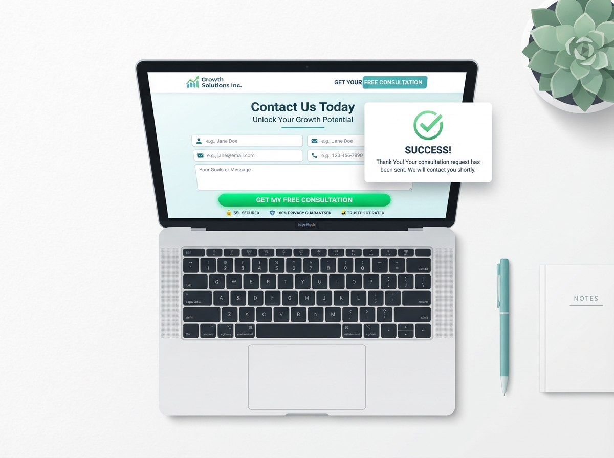
Your contact form might be the most underestimated tool on your entire website. It sits quietly on your Contact page, waiting for visitors to reach out — but if it’s not optimized, most of them won’t. Website contact form optimization is one of the simplest, highest-impact changes you can make to turn more visitors into real leads. In this post, we’ll walk you through exactly how to do it, without needing a developer or a big budget.
Why Your Contact Form Matters More Than You Think
Think about the last time you visited a website and wanted to ask a question. If the contact form was confusing, too long, or felt untrustworthy, you probably left without filling it out. Your visitors do the same thing every day. A poorly designed form doesn’t just lose you a lead — it loses you a potential customer who was already interested enough to seek you out.
The good news? Small tweaks to your form can lead to big improvements in the number of inquiries you receive. You don’t need to redesign your entire website. You just need to remove the friction that’s stopping people from hitting “Submit.”
If you’re also working on improving your overall site experience, check out our guide on website design tips for small businesses to make sure your whole site is working as hard as your contact form.
Common Contact Form Mistakes That Kill Conversions
Before we get into what to do, let’s talk about what not to do. Most contact forms fail for the same handful of reasons, and once you know what they are, they’re easy to fix.
Asking for Too Much Information
Every extra field you add to your form is another reason for someone to abandon it. Asking for a phone number, company name, budget, timeline, and a detailed message all at once feels like homework. Keep it simple. Start with just the essentials: name, email, and a brief message. You can always gather more details once the conversation has started.
Vague or Uninspiring Call-to-Action Buttons
The button at the bottom of your form matters more than most people realize. A generic “Submit” button does nothing to motivate action. Instead, use language that reinforces the value of reaching out — something like “Get My Free Consultation” or “Send My Message”. It’s a tiny change that can meaningfully improve your click-through rate.
No Confirmation or Follow-Up Message
When someone fills out your form and hits send, they need immediate reassurance that it worked. If there’s no confirmation message, they’ll wonder if their message got lost — and some will email you directly or, worse, assume you’re unreliable. Always include a clear thank-you message that tells them what to expect next and when.
Proven Strategies for Website Contact Form Optimization
Now let’s get into the actionable stuff. These are the strategies that consistently improve form performance for businesses of all sizes.
Reduce Fields to the Bare Minimum
Research consistently shows that forms with fewer fields get more completions. Aim for three to five fields maximum. If your business genuinely needs more information upfront, consider using a multi-step form that breaks the process into smaller, less intimidating chunks. People are more likely to complete a form that feels manageable.
Add Trust Signals Near the Form
People are cautious about sharing their contact information online — and rightfully so. You can ease that concern by placing trust signals near your form. These might include a short privacy statement (“We never share your information”), client testimonials, star ratings, or logos of well-known brands you’ve worked with. A little social proof goes a long way.
Make It Mobile-Friendly
More than half of all web traffic now comes from mobile devices. If your contact form is hard to tap, scroll through, or read on a phone, you’re losing a huge chunk of potential inquiries. Test your form on multiple devices and make sure fields are large enough to tap easily, the keyboard doesn’t cover the form, and the submit button is clearly visible without scrolling.
Use Smart Placeholder Text and Labels
Don’t rely solely on placeholder text inside the field to tell users what to enter — it disappears the moment they start typing, which can cause confusion. Use visible field labels above each input, and use placeholder text as a helpful example (like “e.g., jane@example.com”). This small UX improvement reduces errors and frustration.
Set Clear Expectations
One of the biggest reasons people hesitate to fill out a contact form is uncertainty. They don’t know how long it will take to hear back, or what happens after they submit. Add a simple line near your form like: “We typically respond within one business day.” This kind of transparency builds trust and removes a common objection.
Connect Your Form to Automation
Once someone submits your form, what happens next? If the answer is “someone manually checks the inbox and replies eventually,” there’s a better way. Tools like Make.com can automatically send a personalized follow-up email, notify your team via Slack, or add the lead to your CRM — all within seconds of form submission. Learn more about how Make.com automation can streamline your lead follow-up process and keep your response times fast.
How to Test and Improve Over Time
Optimization isn’t a one-time task — it’s an ongoing process. Once you’ve made improvements to your form, track the results. Most website platforms (including WordPress, Squarespace, and Wix) offer basic analytics, and tools like Google Analytics can show you how many people visit your contact page versus how many actually submit the form.
If you notice a big drop-off, consider running an A/B test. Try two versions of your form — one with a different headline, button text, or number of fields — and see which one performs better. Even a 10–15% improvement in form completions can translate to a significant increase in monthly leads. For more ways to improve your site’s performance, explore our post on SEO tips for small business websites.
- Keep your contact form short — three to five fields is the sweet spot for most businesses.
- Replace generic “Submit” buttons with action-oriented language that reinforces value.
- Add trust signals like testimonials or a privacy note to reduce hesitation.
- Always include a confirmation message so users know their submission was received.
- Use automation tools like Make.com to follow up instantly and never let a lead go cold.
Ready to Turn More Visitors Into Leads?
Your contact form is one of the most direct paths between a curious visitor and a paying customer. With the right website contact form optimization strategies in place, you can dramatically increase the number of inquiries you receive — without spending more on ads or traffic.
If you’d like help auditing your contact form, improving your website’s conversion rate, or setting up smart automation to handle your leads, our team at LetsGetSocialOnline.com is here for you. Get in touch with us today and let’s build a website that actually works for your business.