
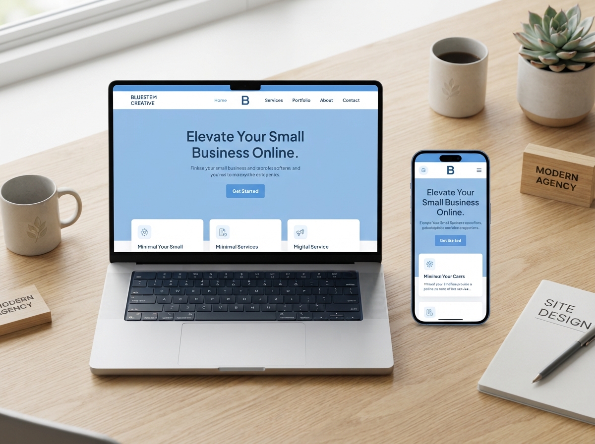
If you’ve ever scrolled down a webpage and suddenly lost track of where the menu went, you already understand the frustration that sticky header UX design is built to solve. A sticky header — one that stays fixed at the top of the screen as users scroll — is one of the simplest, most effective design choices you can make for your website. And for small business owners trying to keep visitors engaged and moving toward a purchase or inquiry, it can make a real difference.
In this post, we’ll break down exactly what sticky headers are, why they matter for user experience, and how to implement them the right way so your site works harder for your business.
What Is a Sticky Header and Why Does It Matter?
A sticky header (also called a fixed header) is a navigation bar that remains visible at the top of the browser window as a visitor scrolls down your page. Instead of disappearing when someone moves past the fold, it follows them throughout their entire browsing session.
This might sound like a small detail, but it has a big impact on how people experience your site. When your navigation is always within reach, visitors feel more in control. They can jump to another section, find your contact page, or click your call-to-action button without having to scroll all the way back to the top. That kind of frictionless experience is exactly what keeps people on your site longer — and what nudges them closer to becoming a customer.
The Connection Between Navigation and Bounce Rate
One of the biggest reasons visitors leave a website quickly is confusion. If someone can’t figure out where to go next, they leave. A well-executed sticky header UX design removes that confusion by keeping your navigation menu constantly visible and accessible. Studies have shown that sites with persistent navigation see lower bounce rates and higher pages-per-session metrics — both of which signal to Google that your site is worth ranking.
If you’re already working on improving your site’s performance, you’ll want to read our guide on website design tips for small businesses to see how navigation fits into the bigger picture.
Key Benefits of Sticky Header UX Design
Let’s get specific about what a sticky header actually does for your business website. These aren’t just design perks — they’re real, measurable advantages.
1. Improved User Navigation
When your menu is always visible, users don’t have to think about how to get around your site. They can explore your services, check your pricing, or head to your blog without interrupting their flow. This is especially important on long-form pages like sales pages, blog posts, or service descriptions where scrolling is expected.
2. Higher Conversion Rates
A sticky header gives you a permanent spot to display your most important call-to-action — whether that’s a “Book a Call,” “Get a Quote,” or “Shop Now” button. When that button is always visible, you’re constantly reminding visitors of the next step without being pushy. That subtle, persistent nudge can significantly increase your click-through and conversion rates.
3. Stronger Brand Presence
Your logo and brand colors stay visible throughout the entire browsing experience. This consistent visual reinforcement builds familiarity and trust — two things that are essential for converting first-time visitors into paying customers.
4. Better Mobile Experience
On mobile devices, sticky headers are even more valuable. Mobile users scroll constantly, and having to tap back to the top of a page to find the menu is genuinely frustrating. A well-designed sticky header on mobile keeps navigation intuitive and thumb-friendly, which matters more than ever since the majority of web traffic now comes from smartphones.
How to Get Sticky Header UX Design Right
Not all sticky headers are created equal. A poorly designed one can actually hurt your user experience — taking up too much screen space, loading slowly, or clashing with your content. Here’s how to do it well.
Keep It Slim and Purposeful
Your sticky header should be compact. On desktop, aim for a height of 60–80px. On mobile, even slimmer. Include only what’s essential: your logo, your primary navigation links, and one clear CTA button. Avoid cluttering it with social icons, phone numbers, and secondary menus — save those for your full header at the top of the page.
Use a Shrinking or Scroll-Triggered Header
A popular and elegant approach is a header that starts full-size at the top of the page and then shrinks or simplifies as the user scrolls down. This gives you the best of both worlds — a bold, branded first impression and a lean, unobtrusive navigation bar as users explore your content. Many modern website builders like WordPress, Webflow, and Squarespace support this behavior with simple settings or plugins.
Make Sure It’s Responsive
Your sticky header UX design must work beautifully on every screen size. Test it on desktop, tablet, and mobile before publishing. A header that looks great on a laptop but covers half the screen on a phone will do more harm than good. If you’re unsure how your current site performs across devices, our team can help — check out our professional web design services to learn more.
Don’t Forget Accessibility
Make sure your sticky header doesn’t cover important content when users navigate to anchor links on the page. This is a common technical issue that can frustrate users and hurt your SEO. A simple CSS offset fix usually resolves it, but it’s worth checking with your developer or web designer.
Is a Sticky Header Right for Every Website?
For most small business websites, the answer is yes. If you have a multi-page site with services, a blog, a portfolio, or an online store, a sticky header almost always improves the experience. The exception might be very minimal one-page sites or landing pages designed for a single conversion action — in those cases, a sticky CTA bar might be more appropriate than a full navigation header.
The key is always to think about your visitor first. What do they need to find quickly? What action do you want them to take? Your sticky header UX design should answer both of those questions at a glance. For more on building a site that converts, explore our post on conversion rate optimization tips for small businesses.
- A sticky header keeps your navigation visible as users scroll, reducing friction and improving the browsing experience.
- Persistent navigation is directly linked to lower bounce rates and more pages viewed per session.
- Including a CTA button in your sticky header gives you a constant, non-intrusive conversion opportunity.
- Keep your sticky header slim, responsive, and purposeful — only include what visitors truly need.
- Test your sticky header on mobile devices to ensure it enhances rather than disrupts the experience.
Small design decisions like this one add up to a website that feels professional, trustworthy, and easy to use — and that’s exactly the kind of site that turns visitors into customers. If you’re ready to upgrade your website’s design and user experience, we’d love to help.
Ready to build a website that works as hard as you do? Contact the team at LetsGetSocialOnline.com today and let’s talk about how smart design choices — like sticky header UX design — can help your business grow online.